A scatter plot is a graphical tool. It has been designed to ensure that it provides a convenient view of the process to the manager at a single glance. The scatter plot studies the correlation between the important variables. When it studies the correlation between two variables, it is called a bivariate scatter plot. When there are multiple variables involved, it is called a multivariate scatter plot.
What is Co-Relation ?
Correlation is the degree to which two variables simultaneously vary. A good example would be that whenever the cycle time is high, customer dissatisfaction is also high. Correlation is recorder on a scale of +1 to -1. +1 shows perfect correlation, while -1 shows perfect negative correlation. However, perfect correlations do not exist and if you come across one, it should be doubted.
Suppose the two variables were being recorded and measures and a high degree of correlation existed, it would provide useful information to the management to run the business better.
Relationship May or May Not be Cause and Effect
Correlation is often confused with causation. This may or may not be the case in reality. Just because we have the statistics to show that the two variables tend to move in tandem does not mean that we have proof that one causes the other. Implying causation could lead to inadvertent losses.
Best Used When One Variable is Under Control
Correlation must be used only when at least one of the variables is under control. This variable will be known as the independent variable. Hence experimenters can vary one variable and record the other variable to determine the extent of the correlation.
Why Visualization is Important ?
Management has to forecast the levels of many variables before they agree on a budget. Correlation helps the management come up with the possible levels of these variables so that accurate budgets can be developed.
Scatter plots provide an important tool for visualization. This is because many times points that are farther away from where most of the points are scattered have the capability of influencing the correlation co-efficient which is the summary statistic. To avoid errors which may prove to be costly scatter plots are used.
What Does a Scatter Plot Look Like ?
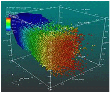
A scatter plot is a set of X and Y axes. One variable is given the x axis and the other one is given the y axis. Each point on the graph has a value corresponding to the x and y axis i.e. both the variables. In case of 3 dimensional or multivariate analyses, more axes are introduced. However such visualizations are complex and require the use of complex software.
When There Are 3 Variables, A 3D Scatter Plot May Be Used. The Image Describes What a 3D Scatter Plot Looks Like.
Himanshu Juneja, the founder of Management Study Guide (MSG), is a commerce graduate from Delhi University and an MBA holder from the esteemed Institute of Management Technology (IMT). He has always been someone deeply rooted in academic excellence and driven by a relentless desire to create value. Recently, he was honored with the “Most Aspiring Entrepreneur and Management Coach of 2025 (Blindwink Awards 2025)” award, a testament to his hard work, vision, and the value MSG continues to deliver to the global community.
Himanshu Juneja, the founder of Management Study Guide (MSG), is a commerce graduate from Delhi University and an MBA holder from the esteemed Institute of Management Technology (IMT). He has always been someone deeply rooted in academic excellence and driven by a relentless desire to create value. Recently, he was honored with the “Most Aspiring Entrepreneur and Management Coach of 2025 (Blindwink Awards 2025)” award, a testament to his hard work, vision, and the value MSG continues to deliver to the global community.
Himanshu Juneja, the founder of Management Study Guide (MSG), is a commerce graduate from Delhi University and an MBA holder from the esteemed Institute of Management Technology (IMT). He has always been someone deeply rooted in academic excellence and driven by a relentless desire to create value. Recently, he was honored with the “Most Aspiring Entrepreneur and Management Coach of 2025 (Blindwink Awards 2025)” award, a testament to his hard work, vision, and the value MSG continues to deliver to the global community.
Leave a reply
Your email address will not be published. Required fields are marked *